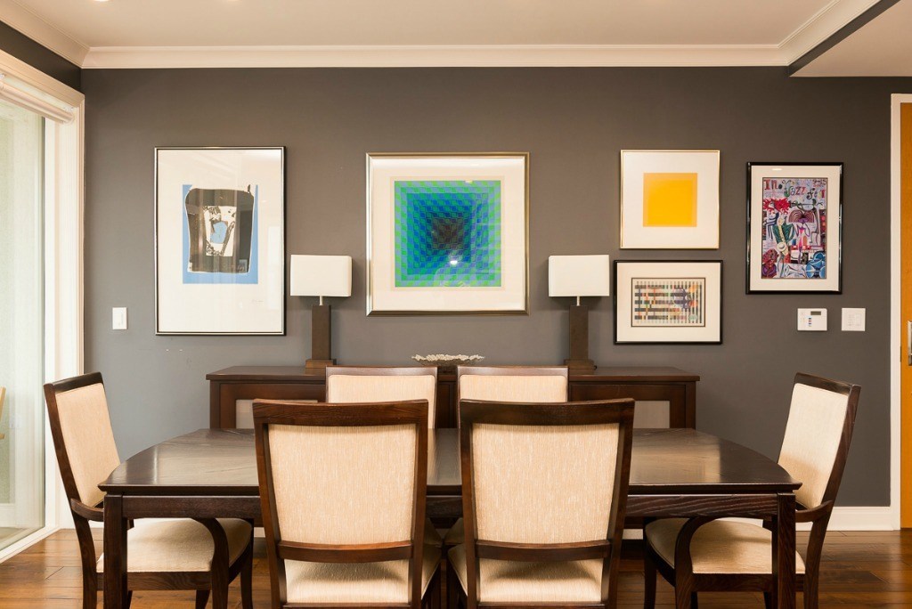
There are two main ways to create balance with your design. The first is SYMMETRICAL design and the second is ASYMMETRICAL.
Symmetrical design is achieved by placing identical objects on either side of a central point. Also referred to as formal balance, this design creates a quiet and restful feeling and suggests restraint, orderliness and formality.
With symmetrical design, everything is perfectly balanced. There is roughly two of everything or items are mirrored in the room. For instance, one chair is placed exactly opposite another one just like it. Identical light sconces are placed on both sides of a framed picture.
While this creates balance, it can also make a room look static and lacking any visual interest or energy.
Experienced designers use asymmetry to create this interest. Asymmetrical design is achieved by placing different objects of equal visual weight on either side of a central point.
Objects balance well because they are judged by their visual weight, not pairings. For instance, you have a large sofa on one side of the room that is balanced by two large overstuffed chairs with an accent table in the middle and floor lamp behind. These pieces balance the sofa visually, even though they aren’t equal in size or shape. The design works because there is balance in the asymmetrical layout of the furniture.
Photo Credit: weitkampinteriordesign.com